Friday, April 23, 2010


EDWARD HOPPER - SUMMER EVENINGS 1947
MY ANALYSIS
2 people in a very ‘lighted’ up porch in a dark atmosphere. The colours of the house are bright and lumanent. The central theme of the painting is the interaction of the 2 people and how they fit in regards to the surrounding environment. The darkness surrounding the building can be described as the mystery that surrounds both people and the potential danger that is close.The interaction between the women and the man is not direct, as the women’s body is not turned to the man, rather it is the experiences they both feel on the porchThe house itself is secured, but its surroundings tell otherwise.
The house is traditional in that the wooden cladding possesses qualities of original ways.The Curtains/Windows/Door suggests the interior is not the most ‘favourable’ place of interaction as the door is shut with the curtains covering the window. The interior ‘atmosphere’ is a lot darker than that of the porchThe clothes their wearing seems to be comfortable to them by looking at their body language. Hence, their relaxing attitude in a more secured area (porch).Although both occupants are relaxed, they seem to be confused and lost in their own world. Both of them are looking towards at the ground, towards the light investigating for answers.
The house is traditional in that the wooden cladding possesses qualities of original ways.The Curtains/Windows/Door suggests the interior is not the most ‘favourable’ place of interaction as the door is shut with the curtains covering the window. The interior ‘atmosphere’ is a lot darker than that of the porchThe clothes their wearing seems to be comfortable to them by looking at their body language. Hence, their relaxing attitude in a more secured area (porch).Although both occupants are relaxed, they seem to be confused and lost in their own world. Both of them are looking towards at the ground, towards the light investigating for answers.
SITE
Occupied huts in the Amazon village.
MY ANALYSIS
Situated in dense forests, It is only reachable by boat. The site being only reachable by boat, further supports ‘mystery’ surrounding the occupants of the huts.The Large dense rainforest makes the surrounding environment ‘unclear’ and ‘dangerous’, similar to that of the painting.The huts seem as the ‘safest’ place to be at the site.The site explores the possible dangers of different spaces but also produces various emotional feelings from moving from one location to another.
Saturday, June 20, 2009
UT FINAL- http://files.filefront.com/DM+ARCH1101+EXP3+YUNIS+ASLut2/;13916532;/fileinfo.html
DRAFT 1 - http://files.filefront.com/DM+ARCH1101+EXP3+YUNIS+AS1ut2/;13916488;/fileinfo.html
DRAFT 2 - http://files.filefront.com/DM+ARCH1101+EXP3+YUNIS+AS2ut2/;13916512;/fileinfo.html
SKETCHUP MODEL OF DINING TABLE AND ELAVATOR -http://sketchup.google.com/3dwarehouse/details?mid=c1dc4969d8baa05c3125b9abb6c88a0b
I did not modify the bridge simply due to the Obama Space. I thought modifying the bridge would defeat the purpose of the overwhelming size of his architecture. I wanted the user to feel inferior while walking along the bridge as this would assist in the power capabilities Obama has.
Obama Space
I attached the Obama space to the bridge as i saw Obama as an instrumental figure which arguably is the world's most powerful man today defining his solid stance on the bridge. He is not going anywhere. This is his bridge (represented by the spike straight through the bridge). The electricity represents his magnitude strength. The structure follows more vertically then horizontally because Obama is at his peak in his life, at the top, and there was no better way to have his office sky high and having stairs leading to his office to intimidate the user while they are roaming. Some textures i left default because i don't see Obama as a fussy person as the White House's exterior has not changed since Obama has entered office.
Madonna Space
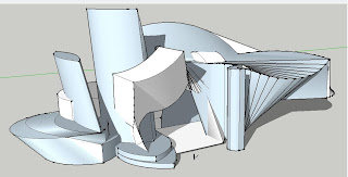
Madonna is a free roaming individual, gained her power through various unrestricted methods. That is why I left Madonna's space hanging in the air above the bridge. The space is defined by many curves, as well as other contributing shapes due to the fact of Madonna's unpredictability. The space was designed intentionally to represent a studio where Madonna performs. That explains the reason for the bright lighting, multi use textures and large spaces.
Meeting Space
Even though Madonna and Obama have obtained power through different methods, i see them as two combustible elements with equal force. This is represented by the 'snake' like space under (starts equally at both ends and eventually gets smaller where the meeting space is). The high level of detail of the space represents both client's importance in the globe. The meeting space is surrounded by circular chords to show their significant role in the globe (orbiting over time) and the world watching. The surrounding objects (around the dining table) represents their need for privacy and their power to block unwanted outsiders. Juxtaposition of the watchers and the unwanted watchers.
Elevator/ Dining table(s)
I constructed many dining tables but the one placed in the meeting space i believe was the most significant. As mentioned, the meeting space is a meeting of two equally powerful figures in which the dining table symbolizes this by the equal leg distribution and classy look. The elevators are quite unique. The Madonna elevator following a semi circular form to represent the curvature of her power. The Obama elevator following a captured metaphor with the elevator representing dominance.
NOTE
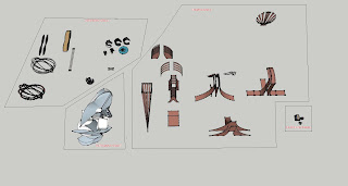
because I had to separate my elevators in sketch up to apply different textures in Ut, I couldn't figure how to make all the static mesh (separate) to move at the same time. I tried and they would split and move at different times. I asked on the forums and no one got it on time so I just used the whole of the elevator which explains for the one textural color (orange). Also note that the movers are weird sometimes: they move only a 1/4, 1/2 way to the desired location and come back to its original position. You have to get off the elevator and try again until the elevator gets to the location it's suppose to. I also added player starts on all three spaces just in case the elevators didn't do what it's supposed to, or you can just 'ghost' it around the environment.
DRAFT 1 - http://files.filefront.com/DM+ARCH1101+EXP3+YUNIS+AS1ut2/;13916488;/fileinfo.html
DRAFT 2 - http://files.filefront.com/DM+ARCH1101+EXP3+YUNIS+AS2ut2/;13916512;/fileinfo.html
SKETCHUP MODEL OF DINING TABLE AND ELAVATOR -http://sketchup.google.com/3dwarehouse/details?mid=c1dc4969d8baa05c3125b9abb6c88a0b
NOTE - To view all work regarding experiment 3 make sure to click on '2009' on the right side.
The mashup is on that page.
BRIDGEThe mashup is on that page.
I did not modify the bridge simply due to the Obama Space. I thought modifying the bridge would defeat the purpose of the overwhelming size of his architecture. I wanted the user to feel inferior while walking along the bridge as this would assist in the power capabilities Obama has.
Obama Space
I attached the Obama space to the bridge as i saw Obama as an instrumental figure which arguably is the world's most powerful man today defining his solid stance on the bridge. He is not going anywhere. This is his bridge (represented by the spike straight through the bridge). The electricity represents his magnitude strength. The structure follows more vertically then horizontally because Obama is at his peak in his life, at the top, and there was no better way to have his office sky high and having stairs leading to his office to intimidate the user while they are roaming. Some textures i left default because i don't see Obama as a fussy person as the White House's exterior has not changed since Obama has entered office.
Madonna Space
Madonna is a free roaming individual, gained her power through various unrestricted methods. That is why I left Madonna's space hanging in the air above the bridge. The space is defined by many curves, as well as other contributing shapes due to the fact of Madonna's unpredictability. The space was designed intentionally to represent a studio where Madonna performs. That explains the reason for the bright lighting, multi use textures and large spaces.
Meeting Space
Even though Madonna and Obama have obtained power through different methods, i see them as two combustible elements with equal force. This is represented by the 'snake' like space under (starts equally at both ends and eventually gets smaller where the meeting space is). The high level of detail of the space represents both client's importance in the globe. The meeting space is surrounded by circular chords to show their significant role in the globe (orbiting over time) and the world watching. The surrounding objects (around the dining table) represents their need for privacy and their power to block unwanted outsiders. Juxtaposition of the watchers and the unwanted watchers.
Elevator/ Dining table(s)
I constructed many dining tables but the one placed in the meeting space i believe was the most significant. As mentioned, the meeting space is a meeting of two equally powerful figures in which the dining table symbolizes this by the equal leg distribution and classy look. The elevators are quite unique. The Madonna elevator following a semi circular form to represent the curvature of her power. The Obama elevator following a captured metaphor with the elevator representing dominance.
NOTE
because I had to separate my elevators in sketch up to apply different textures in Ut, I couldn't figure how to make all the static mesh (separate) to move at the same time. I tried and they would split and move at different times. I asked on the forums and no one got it on time so I just used the whole of the elevator which explains for the one textural color (orange). Also note that the movers are weird sometimes: they move only a 1/4, 1/2 way to the desired location and come back to its original position. You have to get off the elevator and try again until the elevator gets to the location it's suppose to. I also added player starts on all three spaces just in case the elevators didn't do what it's supposed to, or you can just 'ghost' it around the environment.
Subscribe to:
Posts (Atom)


